Sites
General
11DAKMA
All Girl Army
Black Looks
Blog Sisters
Crooked Timber
funferal
Household Opera
jill/txt
Jonathan Goodwin
Long Pauses
New Kid on the Hallway
Obsidian Wings
Pharyngula
Rad Geek
Sorrow at Sills Bend
the chutry experiment
thinking with my fingers
tonari no shibafu
Rhetoric
cbdCharlie Lowe
Clay Spinuzzi
Collin vs. Blog
Community College English
Dennis Jerz
Earth Wide Moth
Jeff Rice
Kairosnews
Samantha Blackmon
Steven Krause
The Blogora
Thinkery
This Public Address
vitia
Copyright/IP
Academic CommonsCopyfight
Creative Commons Weblog
Free Culture Blog
Frank Field
Infocult
Lawrence Lessig
MediaCommons
Napsterization
User login
About
I'm Clancy Ratliff, an associate professor in the Department of English at the University of Louisiana at Lafayette, where I am also the Assistant Director of First-Year Writing. I'm married with three children.
See my vita to find out more about where I've been and what I've done.
Email me: clancy.ratliff, gmail
| www.flickr.com |
Creative Commons License
© Copyright 2003-2015
Clancy Ratliff.

This work is licensed under a Creative Commons Attribution 4.0 International License.


Comments
rofflecopters!
I thought I was safe after swearing off b3ta and fark until exams were over...
Uh ...
Erudite Redneck says:
Yer new '80s-era slightly lesbo header is ... well ... turnin' me on.
That is all.
Peace, and come see me !!!!! :-)
--ER
Image in context
Here's the image in context:
The Annie Whitman character was a kind of rival for Jessica Wakefield (the blonde). She was called "Easy Annie" and had a bad reputation, so she was more popular with the boys than Jessica.
A while back, I also designed a masthead with this image, but everyone told me it was too homoerotic:
Which is fine, really, but perhaps distracting given my mostly academic purposes in keeping this blog.
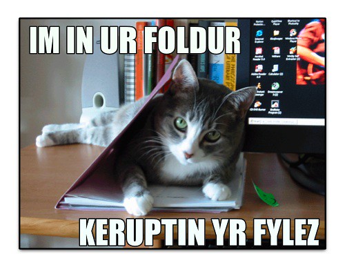
ROFL AWWWWFUL LOLCATS
2 Board Alley
As much as I love cats, and as much as I want Mike's cats to have a joyous birthday (maybe he'll take them to the opera to hear "Der Fliedermouse),I have to say that LOLCATS is so hilariously revolting that it has driven me to My Cat Hates You as an antidote.
Regarding your masthead changes--what I find most interesting is that each illustration offers a whole different take on feminism and rhetoric. The black cat reminds me of a witch's cat and suggests that either we are still witches 'cause we're smart women, or that there is magic to be had in the mix of feminism and rhetoric. The Nancy Drew image with the clock hits home with me because lately I've been thinking about how feminism seems like an historical event to so many of my female students--that it isn't a living ideology or something they'd best be thinking about as they head out into the work world.